[ UX / UI ]
BPI /
The home of British music awards.
Role
Digital Design Lead.
Agency
Master
Credits
Joel Kitzmiller (CD).
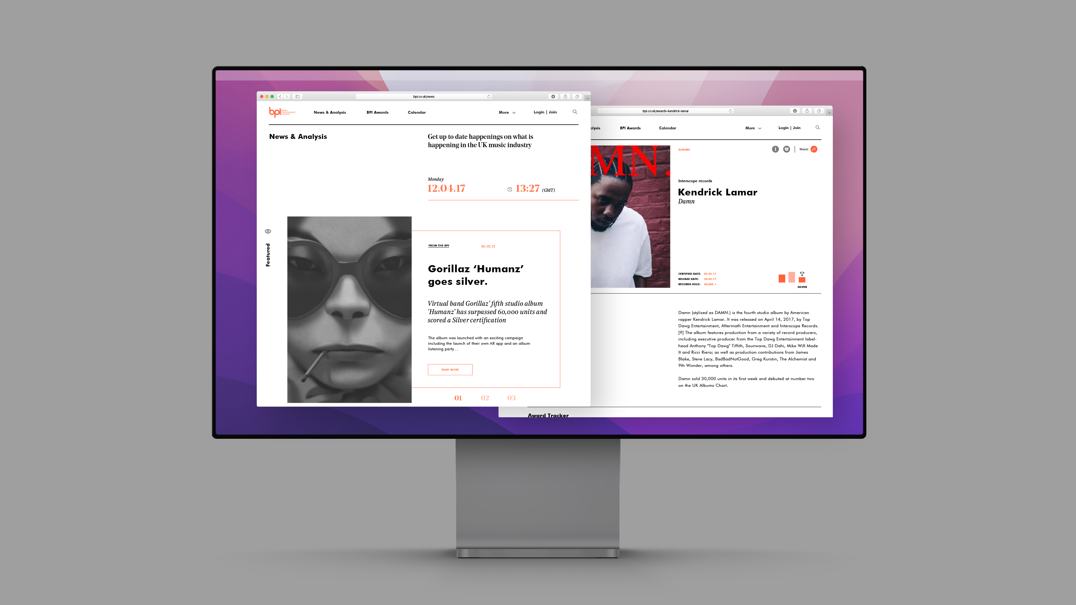
The BPI is the trade association responsible for representing the interests of the British music industry. Their main goals are to help promote British music, whether through awards shows e.g the Brit Awards and the Mercury Prize or after through copyright interests. They've been long standing as one of the UK's most important industry tools, however after many years of service their product was in need of a complete overhaul from the ground up. The goal was simple, create a digital experience that reflected their true position in the industry as the single best music resource in Britain.
01 /
From the ground up.
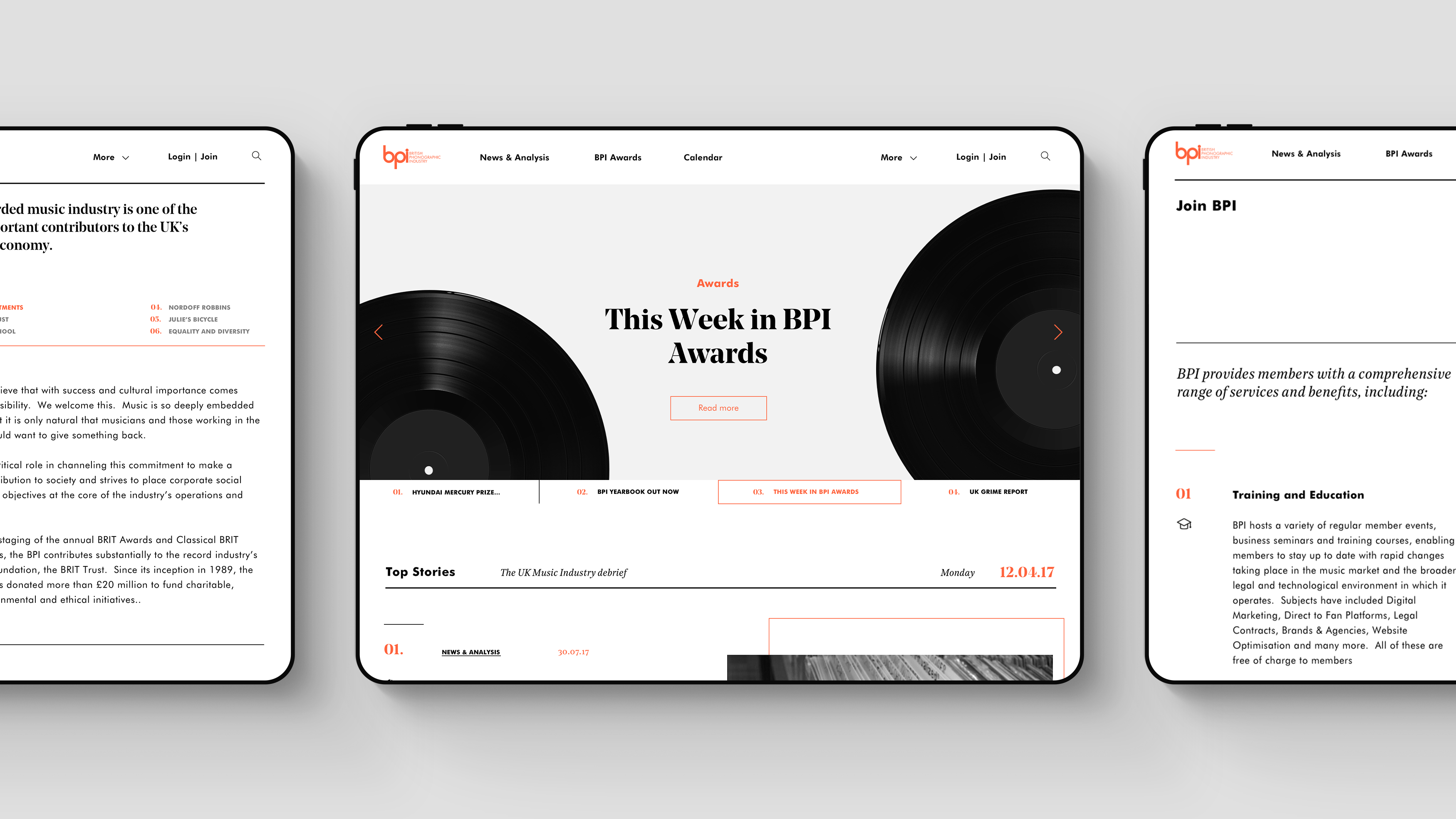
The BPI appoached us with simple website redesign brief. It quickly became clear however, that in order to help them meet their objectives it would require a much deeper dive into thier core offering. We started with refousing their content strategy for the site by helping to unlock the potentisal of the diverse range of information and media within their network. The next step was to take these learnings and begin crafting a bespoke user expierence that would not only showcase the sites core features in a clear and direct package, but also provide increased vaule to its membership program.
Main objectives
01 / Realign the experience to reflect the BPI's unique content & insights.
02 / Create a cler and refined user interface.
03 / Mitigate website retention & boost membership revenue.
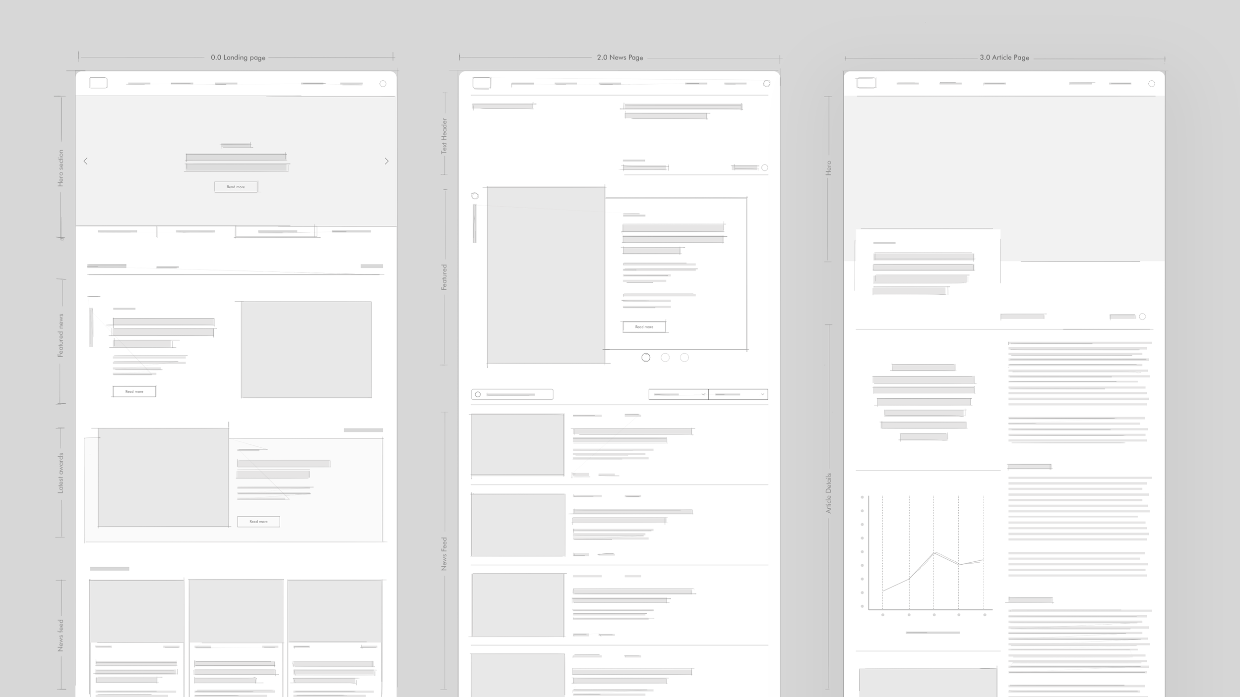
Wireframes & UI development /
02 /
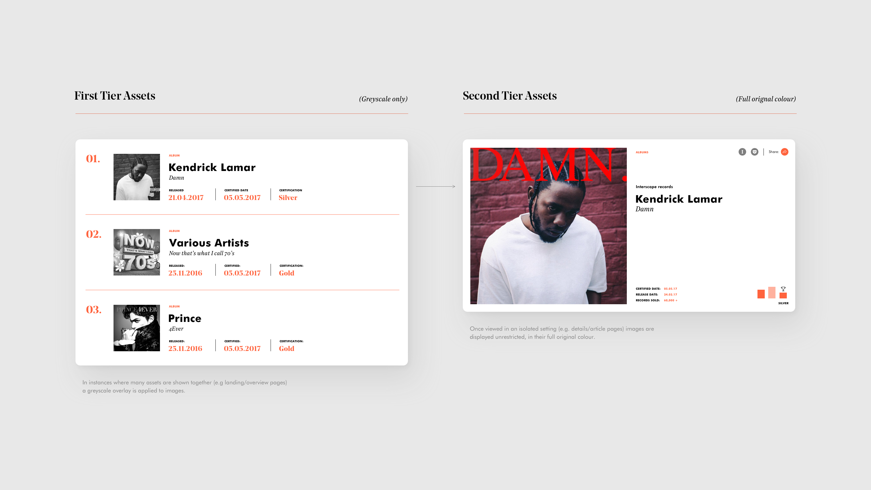
Not all assests are created equal.
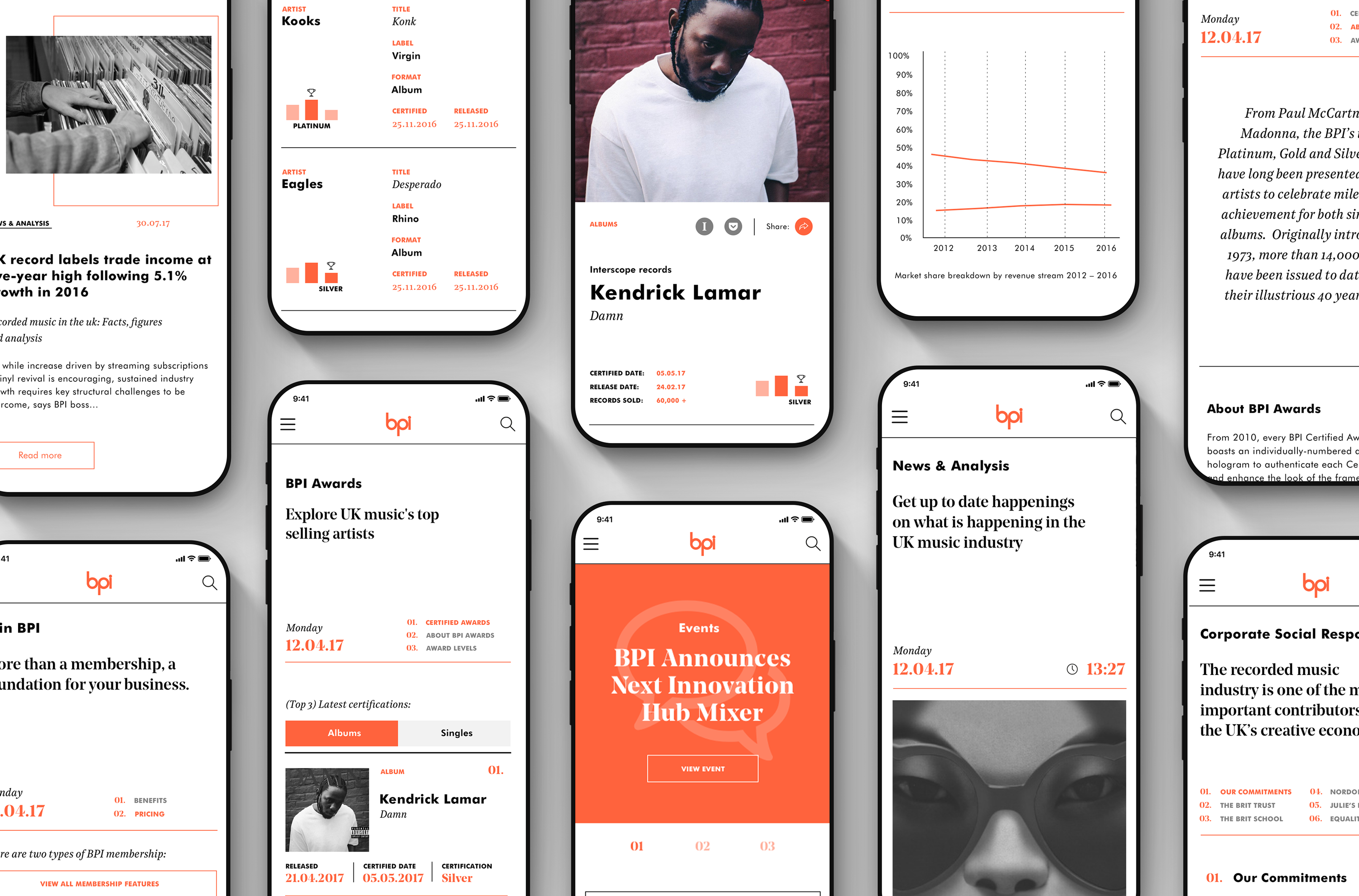
One of the main obsticles we faced early on from a visual prespective was how best to create contiunity between a range of assets from various sorces, often with different levels of visual standards. The soultion was to create a tiered visual system, at top level in instances when many assets would appear togther a greyscale overlay would be appied. This would not only compliment the rest of the UI, but more importanly would help avoid distracting a users focus from important data & information as they navigate the site. Once a user went a level deeper (to an article of details page) the images shown in isolation would be displayed in full original colour.
What began as a purley digital discussion soon evolved into an almost complete redesign of the BPI's visual design system. This included a new type system, colour palette and a comprehensive set of brand guildines to help manage visual standards moving forwards.
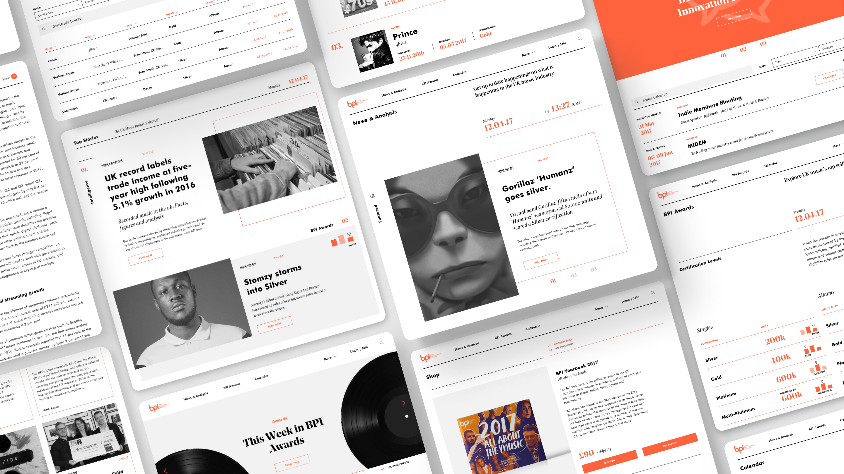
Bespoke icons /
In many instances articles would require fall back cover images. These could be used for both hero illustrations or functional icons.
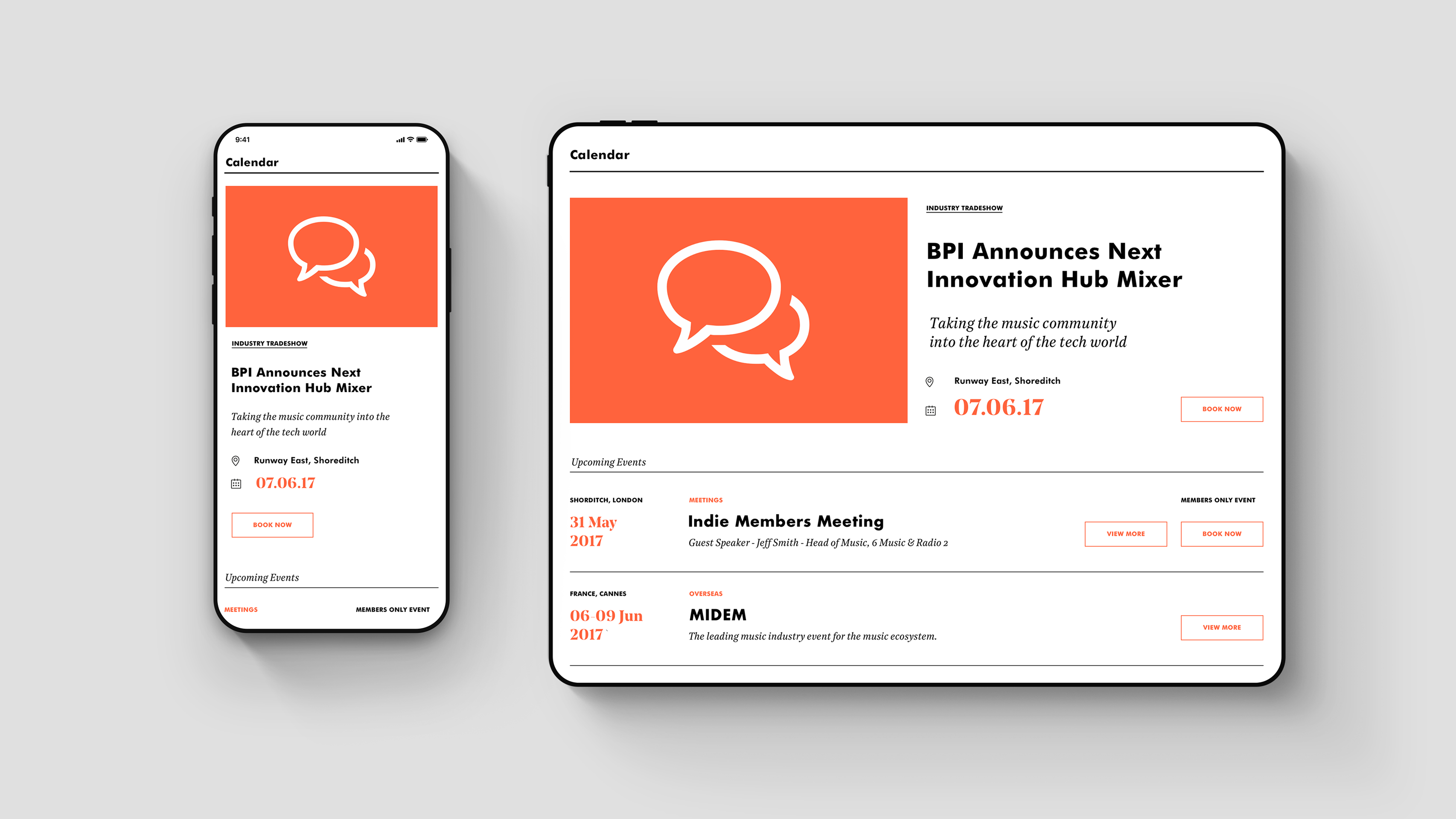
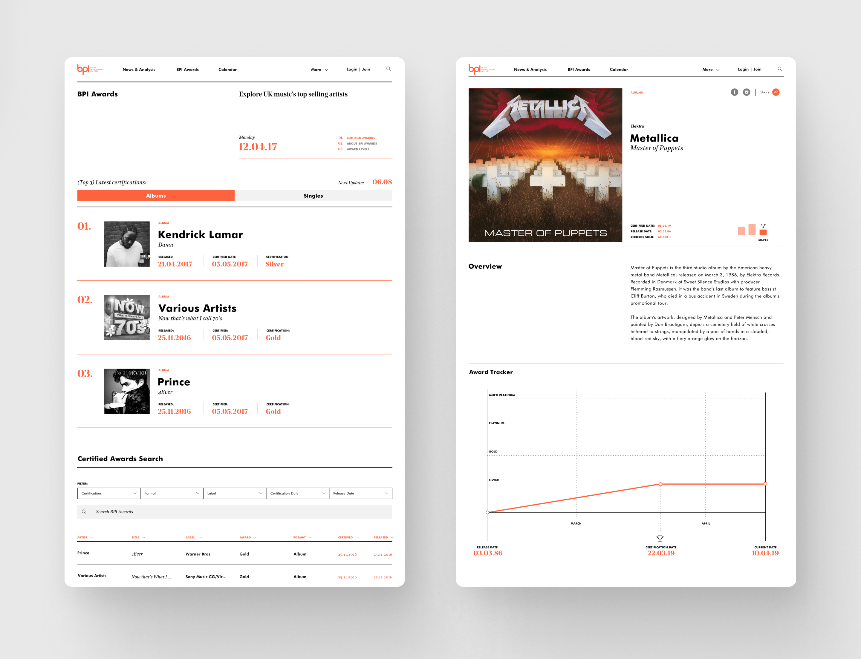
A refined discovery tool /
We worked through the BPI's enormous back-catalogue of certification data and developed a more accessible experience for the BPI's certified awards; now searchable and filterable by certification, label, format, and release date.
✦ Omar Hraib / Design Director.
Got a project you'd like to discuss? Let's talk.
hello [@] omarhraib.com / +44 (0) 7932250050
© Omar Hraib Ltd 2022