[ Product Design ]
Foodpanda /
Food delivery. Reimagined.
Role
Lead UI Designer.
Agency
DesignStudio
Team
Cam Butler (CD), Elise Santangelo (DD), Alison Haigh (Sr. Designer), Toby Cotrell (Designer).
Foodpanda is a food and grocery delivery service operating in 50+ countries worldwide and is currently the largest food delivery platform in Asia. With an ever increasing offering their product was in need of a complete re-evaluation of both the user experince and interface design. The aim was to reconsider how best to present a potentially overwhelming amount of choice to users, whilst anticipating needs and delivering delight.
01 /
Food delivery. Reimagined.
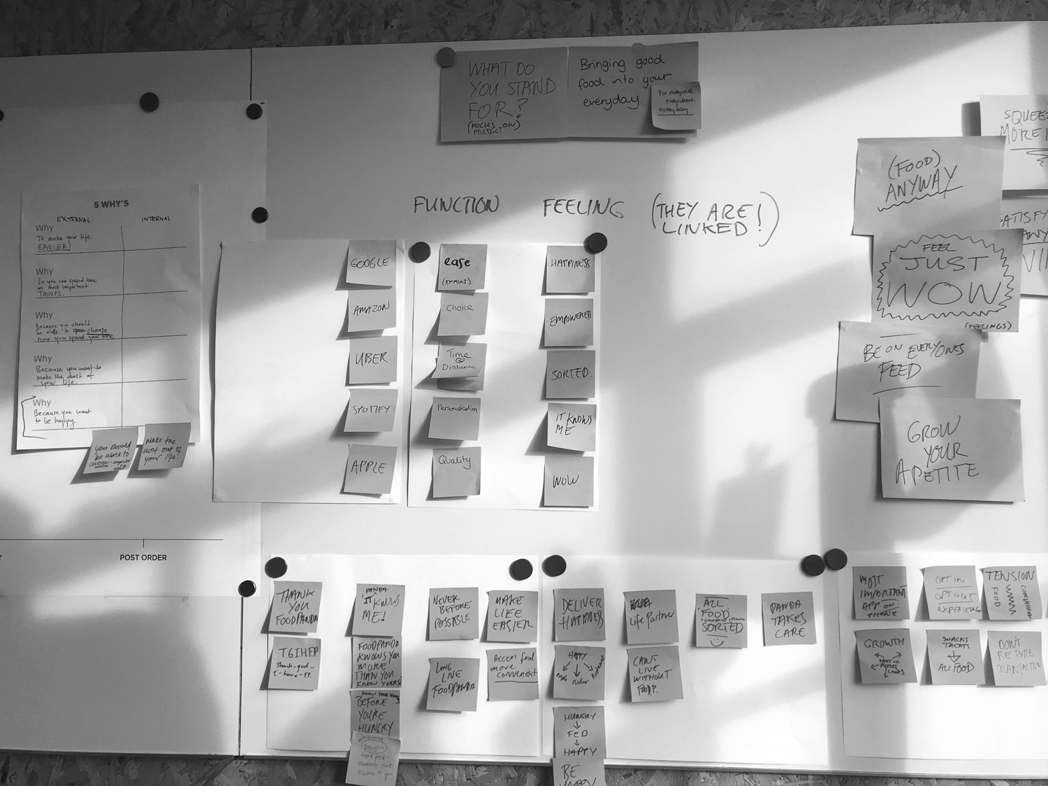
Over the course of two workshops in both London and Berlin we worked directly with Foodpanda's internal product teams. The focus was to identify the current pain points in the user experience and their amibtions for a reimagined food delivery service. We learned the experience had become too rigid to accomidate the ever growing number of verticals the business had to offer.
The goal was to create a interface flexible enough to not only promote key sales initiatives like deals & offers, but also provide a space to surface the most relevant content to inidividual users. We then defined the key user attributes we'd need to pull from in order to achieve this. These included; location, time zone, preferences and previous history when using the app.
Main objectives
01 / Create a distintive user experince that streamlines discovery.
02 / Define a modular system that automatically prioritises contextual information.
03 / Build a flexible solution to hero regional specfic deals & offers.
02 /
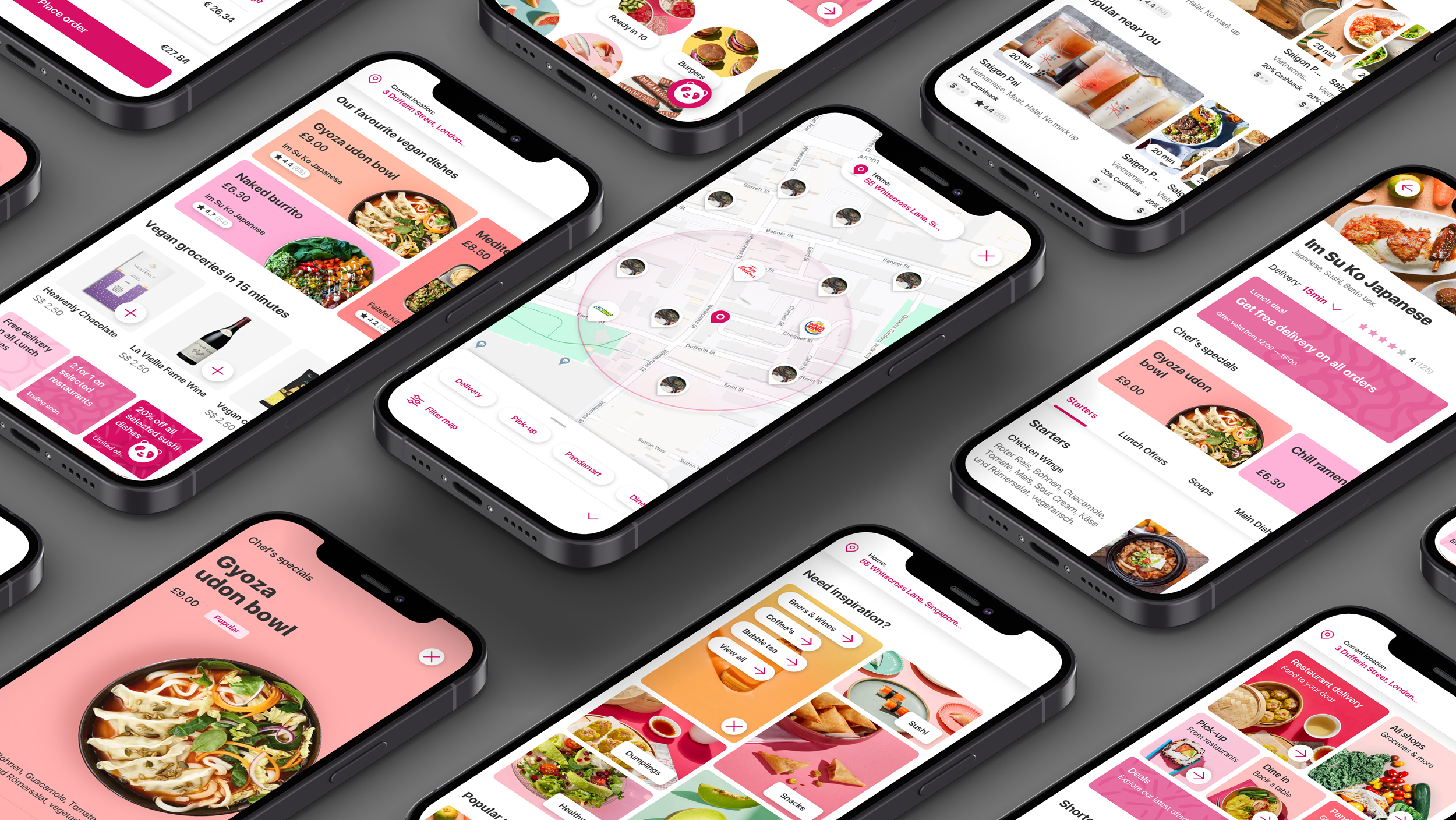
The Bento Box
In order to facilitate this change at a holistic level we needed to establish a visual design concept that would unify the various teams creative decisions regards of their location and task. The 'Bento Box' embodies all the core values we wanted to inject into the new Foodpanda experience; convience, variety and structure. This became our core design concept. To help action this we then developed a set of design priniples, helping to guide the process and keep us on course for buliding a distinctive product experience.
Design principles
01
Design for habits
Learn preferences and patterns to better anticipate needs, simplify and personalise.
02
Keep in the loop
The experience continues — every interaction should lead to another one.
03
Empower local flavour
Celebrate local knowledge and cultural nuance, for users and our teams.
04
Make it bite sized
Help people easily digest, navigate, discover and share.
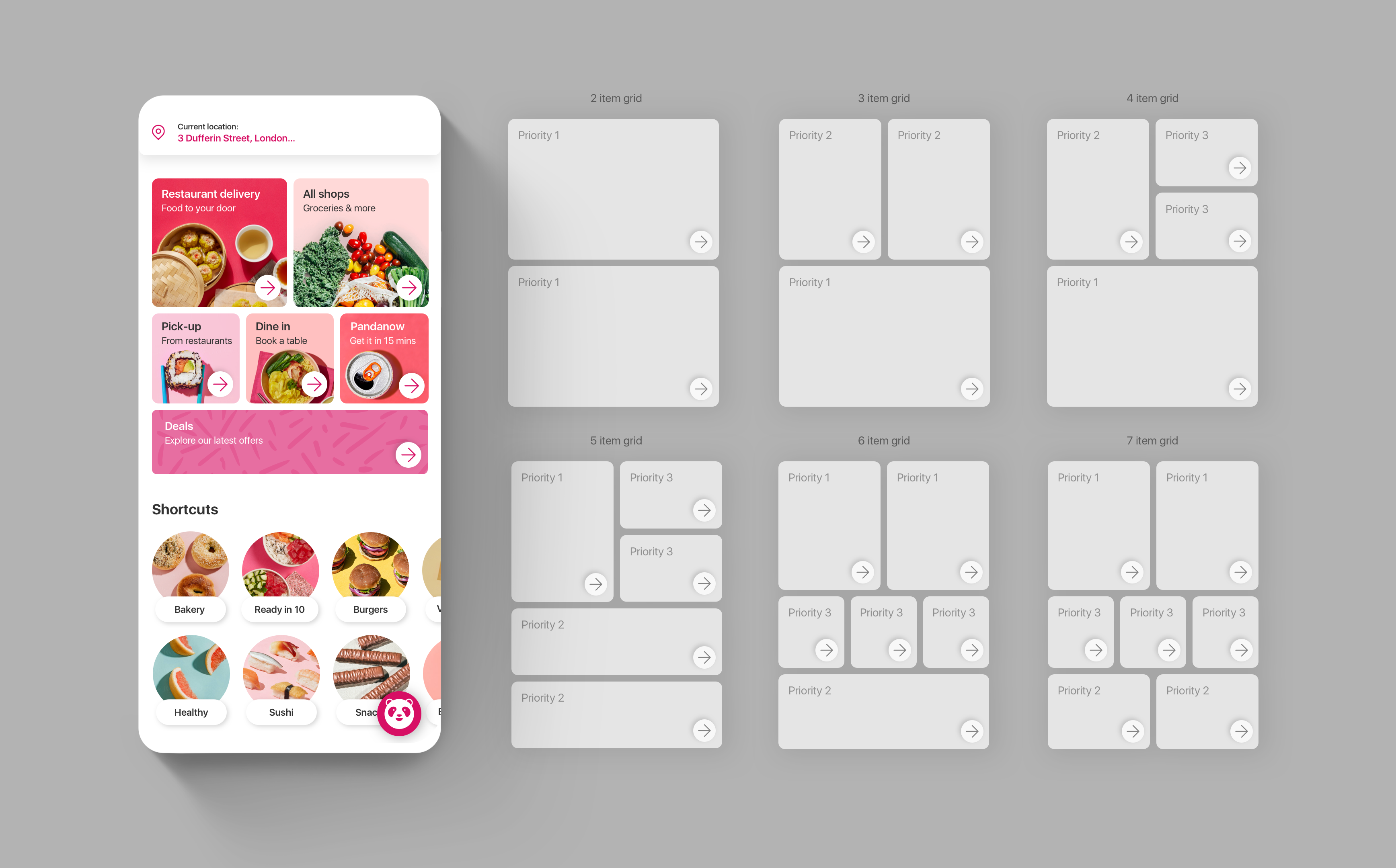
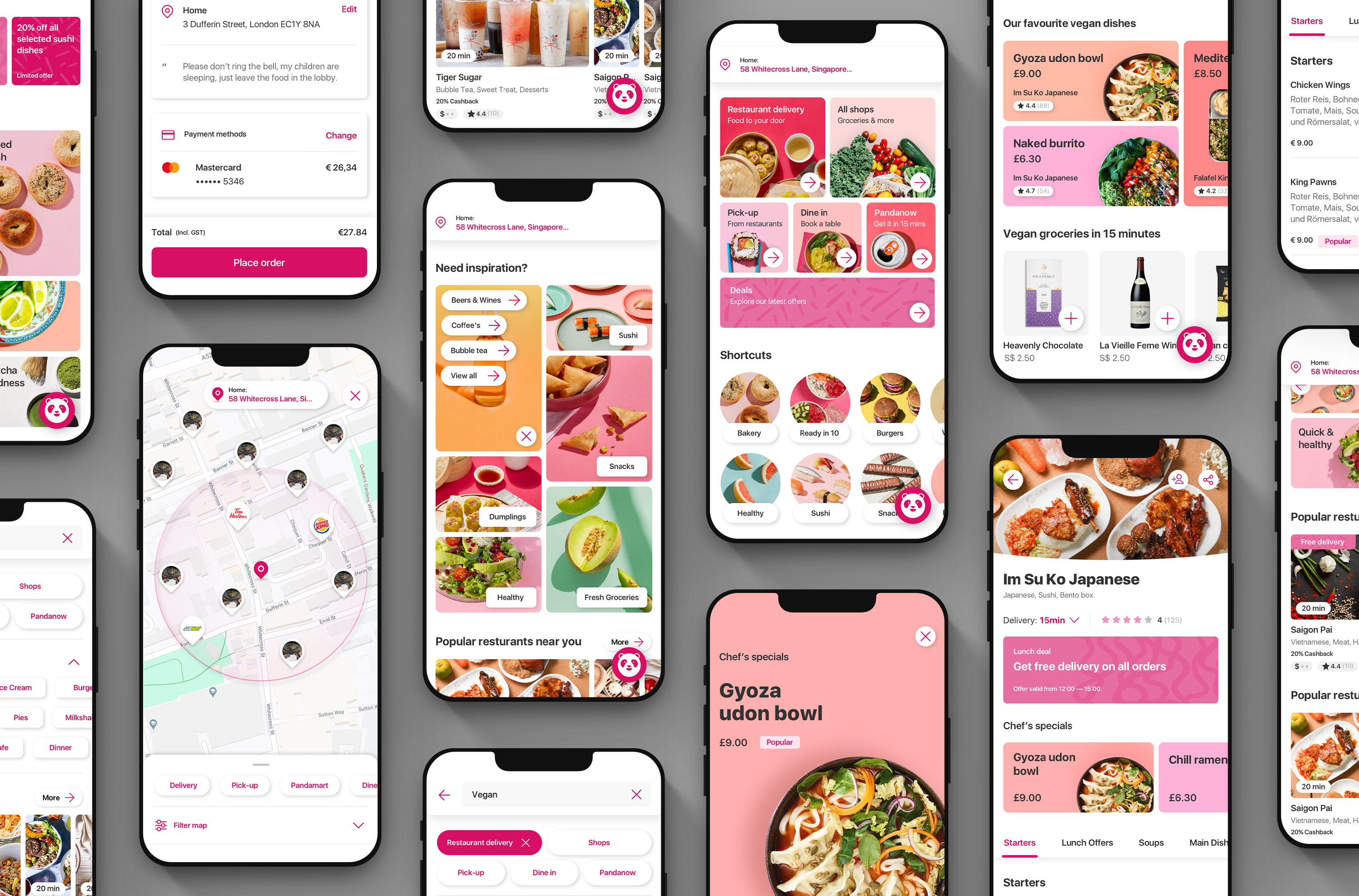
Adaptive grids /
The grid structure was developed to accomidate a varity of different content. This could be displayed in order of prioity for a specfic user or market.
Antisipating needs /
Surfacing contextual filters higher in the customer journey helps guide users to more relevant content, empowering them to make more informed decisions when searching
Keep in the loop /
Giving users a clear idea of what to expect creates a more fluid journey of discovery, encouraging them to explore further.

Bite sized /
Keeping surface level content concise allows users to scan content quickly when making choices. They can then dive a level deeper for a closer look before comminting to exploring a topic further.
03 /
Peak & Pop
Giving users the opportunity to preview content (peek) before they commit (pop) was a hugley impactful solution towards decluttering the user experience. It allowed us to surface deals & offers higher in the journey, without detracting from the users overall exploration of content. This ensured that business objectives could remain present at key moments of the experience, without ever becoming too overwhelming or aggressive.
04 /
User Powerd Swimlanes
Due to the sheer number of vendors and segments on offer, we needed to create a way to help guide users through the content. Adding contextual filters allowed us to optimise customer entry points, helping them find what they wanted sooner. We then developed a responsive interaction for browsing through vendors. This not only made discovery more engaging but also gave an better overview of what was coming up next.
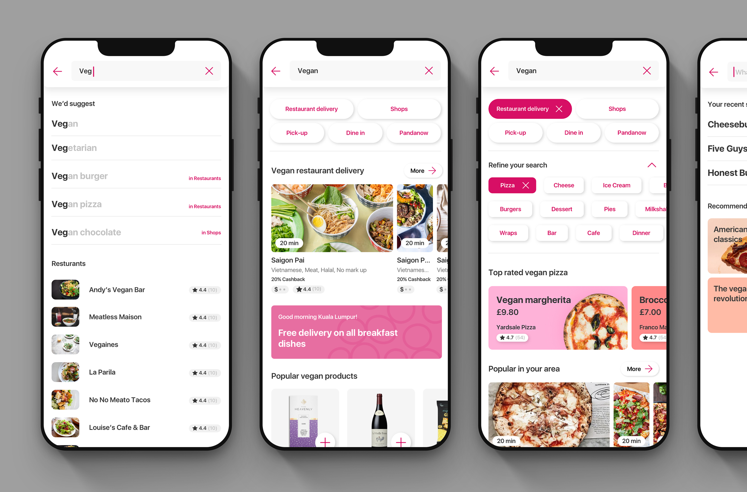
Intuitive search /
The global search antipates the users entry. A tiered filtering system then helps narrow things down, with most relevant results suggested and upated at each stage of the journey.
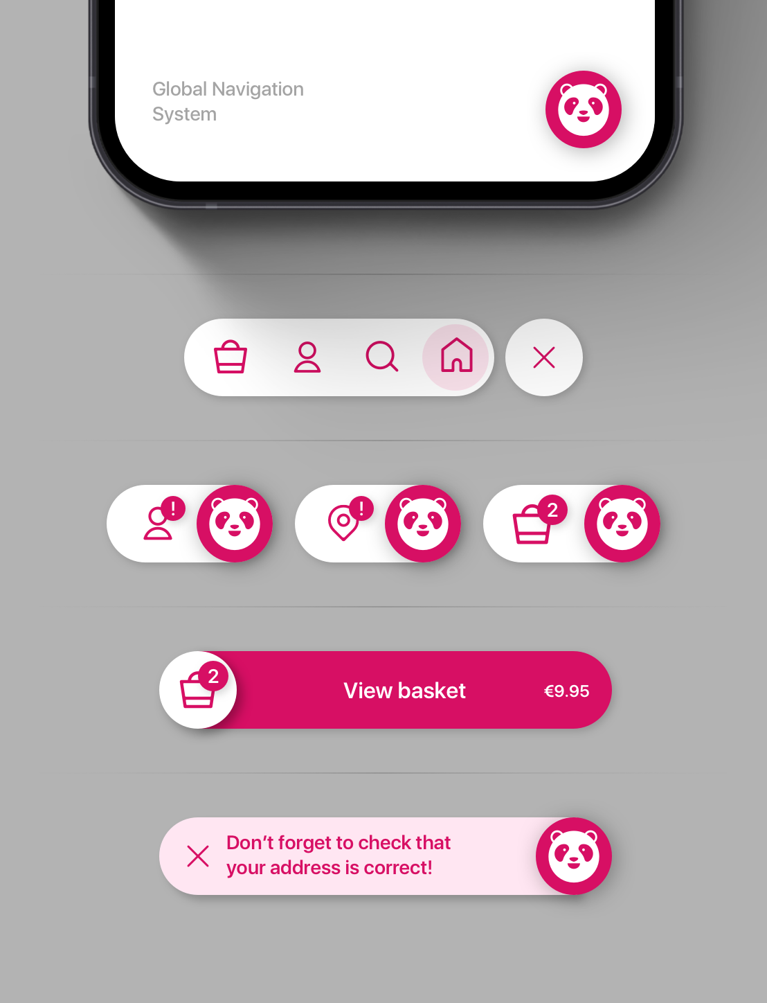
Versatile navigation /
The simple yet powerful navigation system can alert users of any required tasks or new notifications. Updating to show the most relavnt information/action as you progress through the experience.
Custom icons /
Updated set to match the new, softer UI.
✦ Omar Hraib / Design Director.
Got a project you'd like to discuss? Let's talk.
hello [@] omarhraib.com / +44 (0) 7932250050
© Omar Hraib Ltd 2022