[ Design System ]
OLX /
Making second-hand the smart choice.
Role
Lead UI Designer.
Agency
DesignStudio
Team
Cam Butler (CD), Elise Santangelo (DD), Alison Haigh (Sr. Designer) Antonino Iacona (Animation).
OLX is one of the world’s most successful online classifieds businesses, operating in over 40 countries. Despite huge growth and dominating many of the markets it operated in, its brand and digital experience were a long way from best-in-class. And this was putting the long-term defendability of the business at risk. Facebook’s rapid growth into community classifieds and Amazon’s dominant position as ‘the cheap option’, meant OLX needed to connect with people around a new sentiment – something that took them beyond classifieds.
01 /
(Re)Building trust.
One of the key takeaways from the re-brand phase of the project was that many potential customers in the companies key markets had a negative perception of buying second-hand. In order to shift this perception the brand aimed to deliver a more positive sentiment around second-hand trade, by tapping into the practical side of things — using OLX just makes sense. It makes it easier for people to sell almost anything, and make some extra cash. It saves money, keeps it in local communities, supports small businesses and saves the planet. Ultimately, it’s the smart thing to do.
'Smart Choices' became the brands key strategic proposition. It helped to drive creative decisions not only for brand and marketing touchpoints but was also a sentiment that would run through to the customer's entire journey when using their product.
Main objectives
01 / Create a design system that reflects the new branding/visual identity.
02 / Build a comprehensive UI toolkit for use by internal teams, globally.
03 / Refine the user experience to help build customer trust and shift detractor perceptions.
Inherited brand assets /
(Created by DesignStudio)
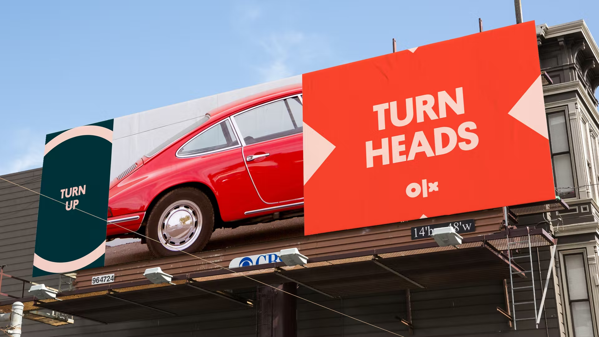
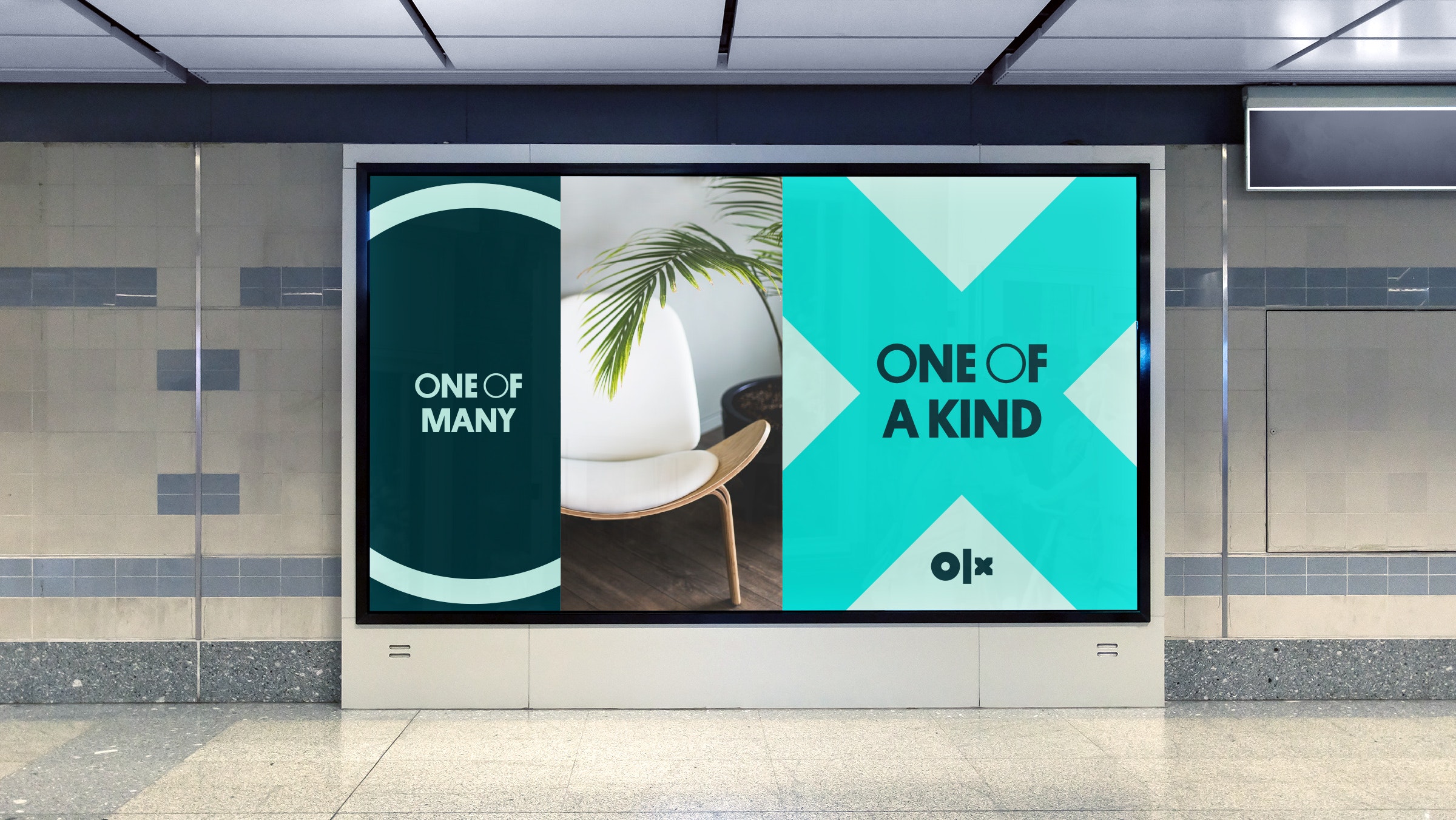
Examples of the visual identity that were adopted and evolved to produce the Product UI Design System. This included brand elements like Logos, Tone Of Voice and Art Direction.
02 /
The smart choice.
Although there was now an established brand identity in place, one of our first challenges was to identify which brand elements would translate well to a product UI. Many of the inherited brand assets looked great in marketing and social comms, but in many cases lacked the flexibility and nuances required to deliver a comprehensive user interface. This meant revisiting and evolving certain elements of the brand for digital outputs, this included; typographic hierarchy, refining colours (with accessibility in mind), simplifying icons and photographic art direction.
UI components /
Responsive grids /
The modular grid system can grow and flex to any viewport, with the ability to integrate hero modules throughout the results feed.
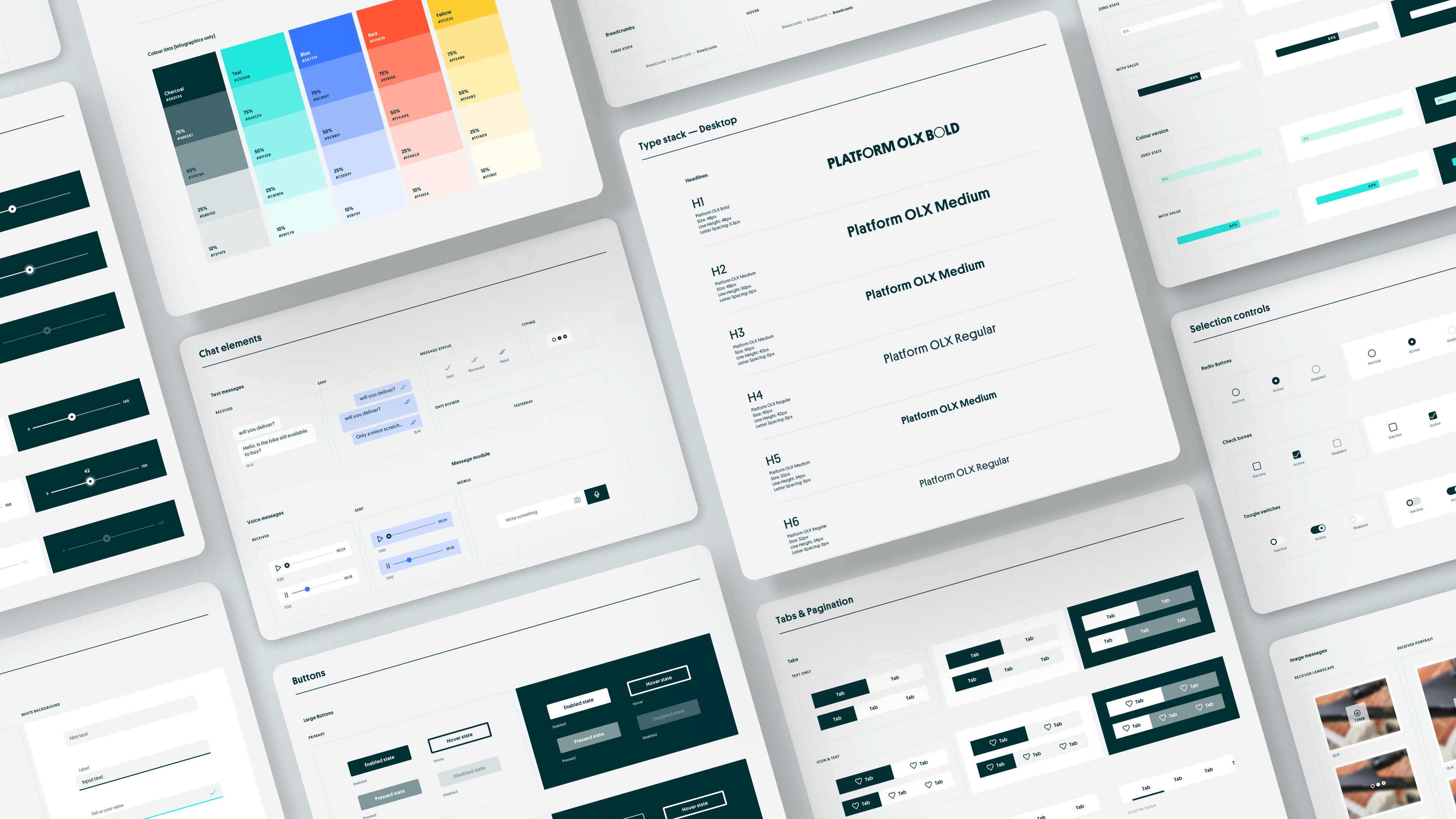
UI toolkit /
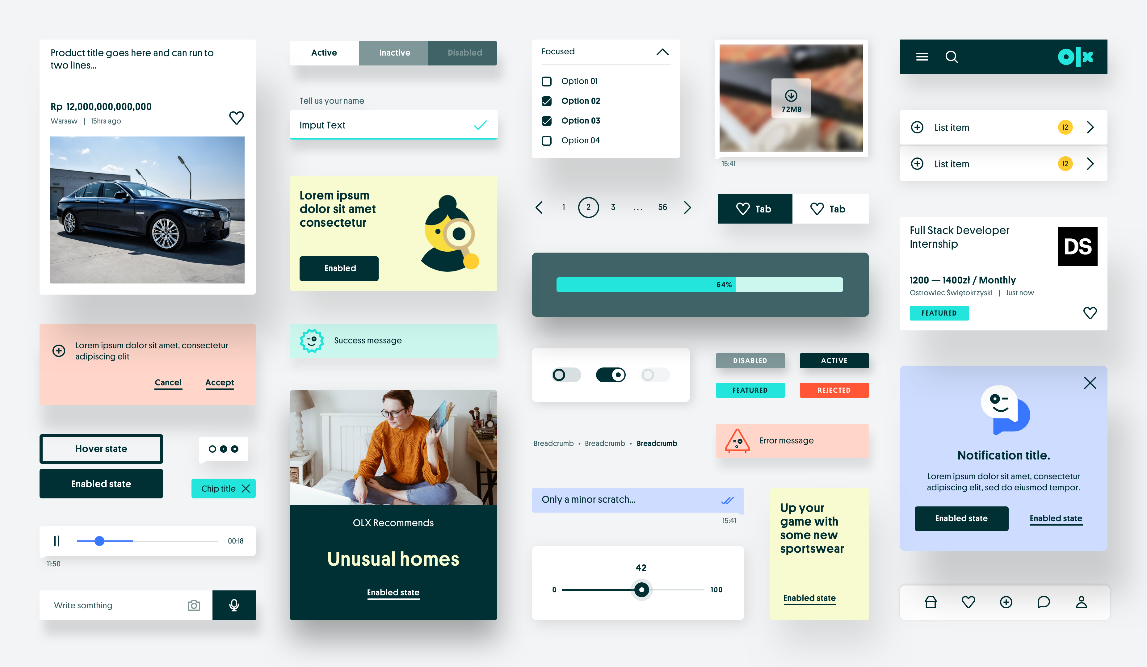
We delivered a comprehensive UI library for internal product teams to use across all OLX global markets.
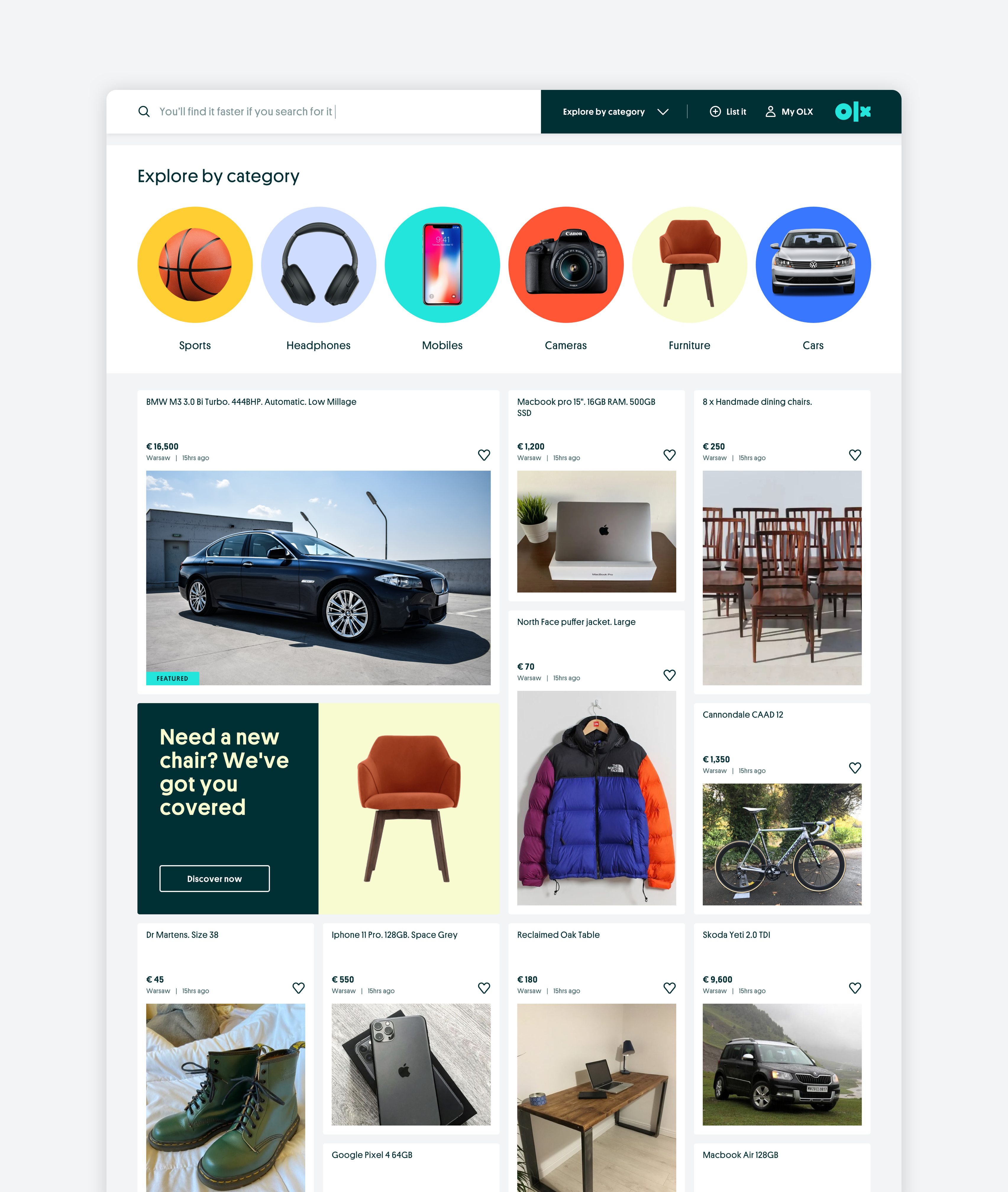
A helping hand /
Helpful assistance modules can be featured throughout the grid to help guide users to what they need.
Iniuitive search /
The global search bar incorporates suggested results and featured/trending products, to help users find what they need, faster.
Conversational UI /
Discovery suggestions and prompts appear after a period of user inactivity.
Message behaviors /
Exploring how the UI elements respond in a functional setting.
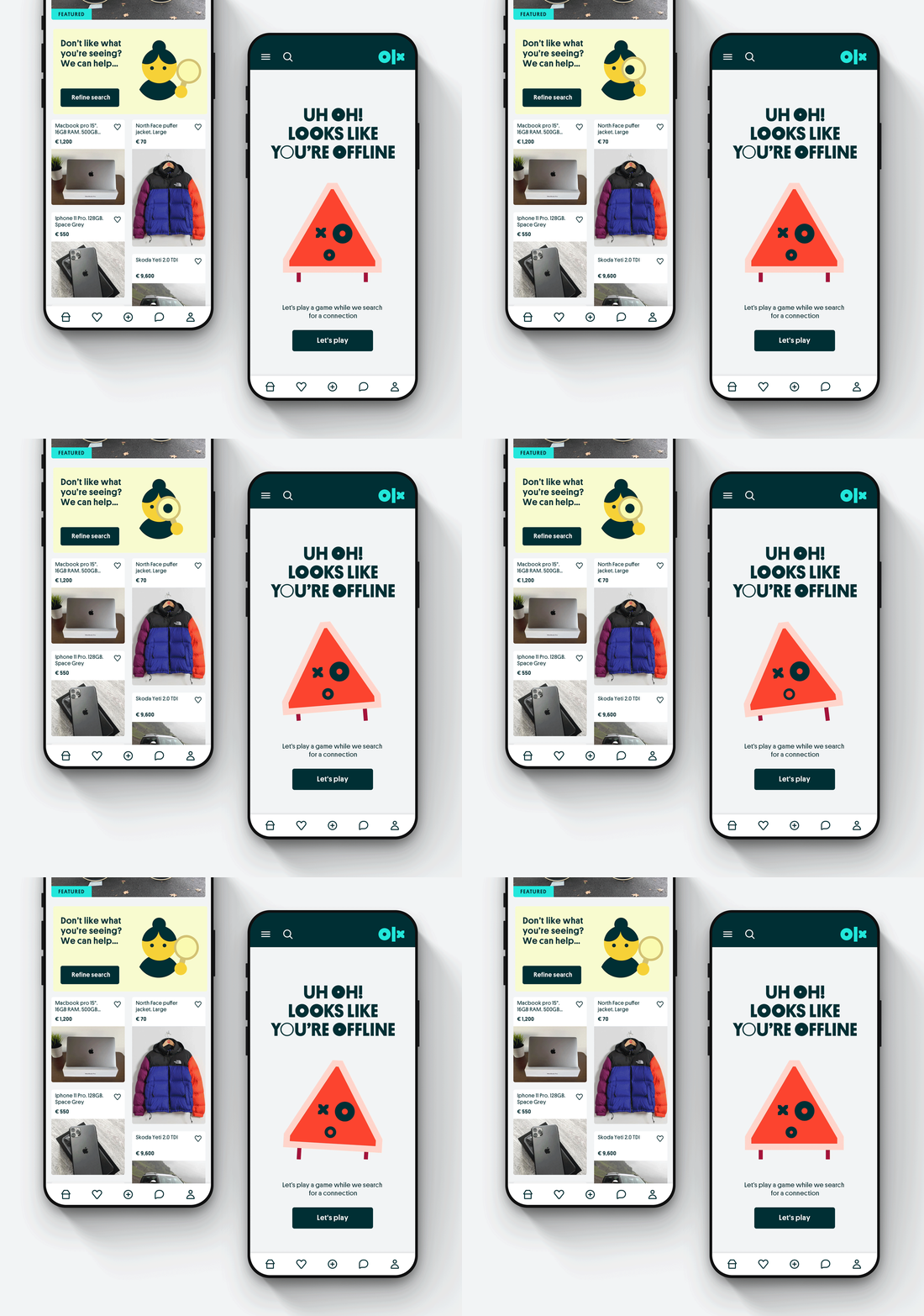
Delivering the unexpected /
Low bandwidth animations were placed in key instances throwout the user experience, this helped to engage users and offer reassurance.
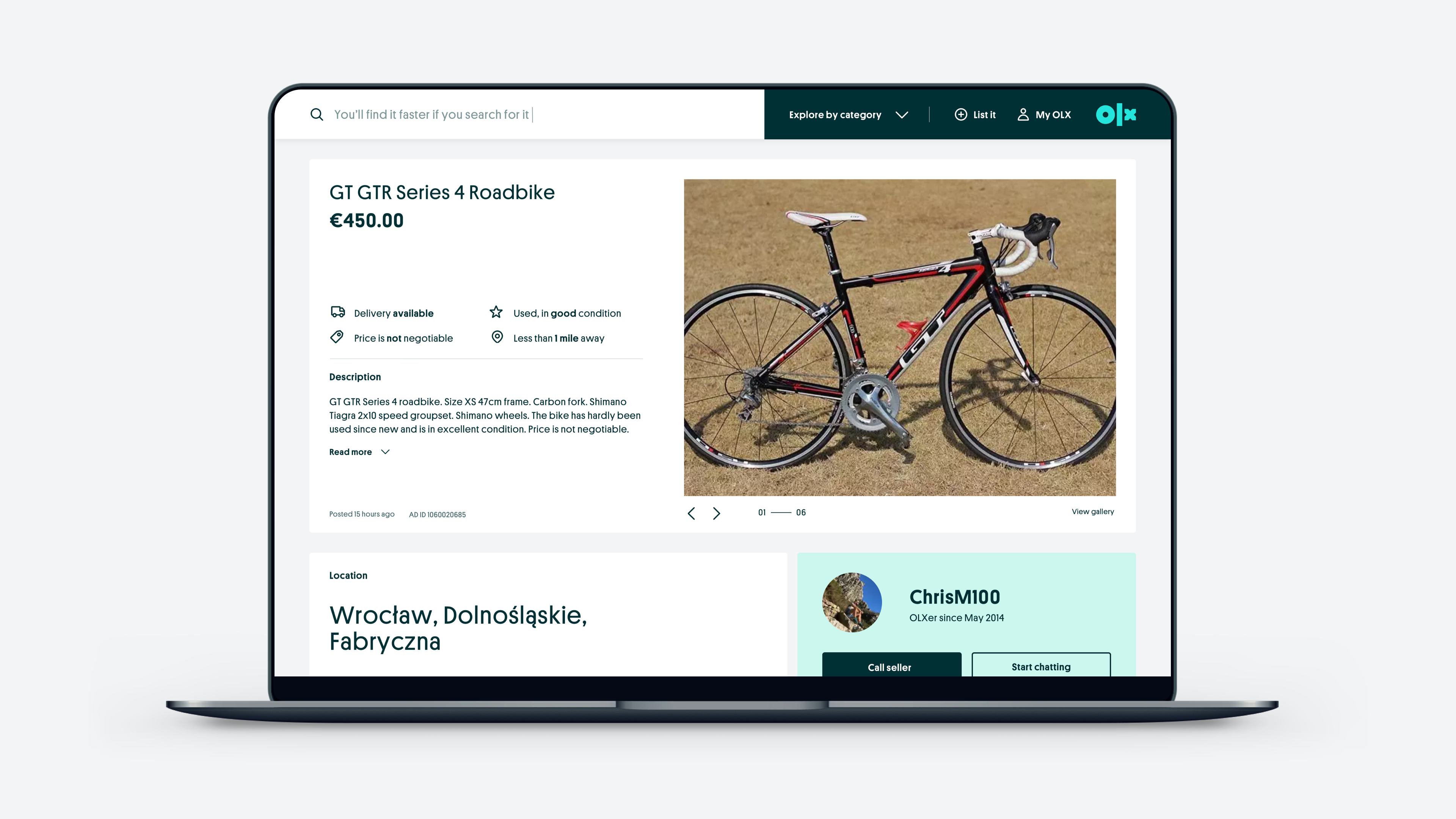
Product listings /
Ensuring essential information is visible above the fold helps to legitimise the listing.
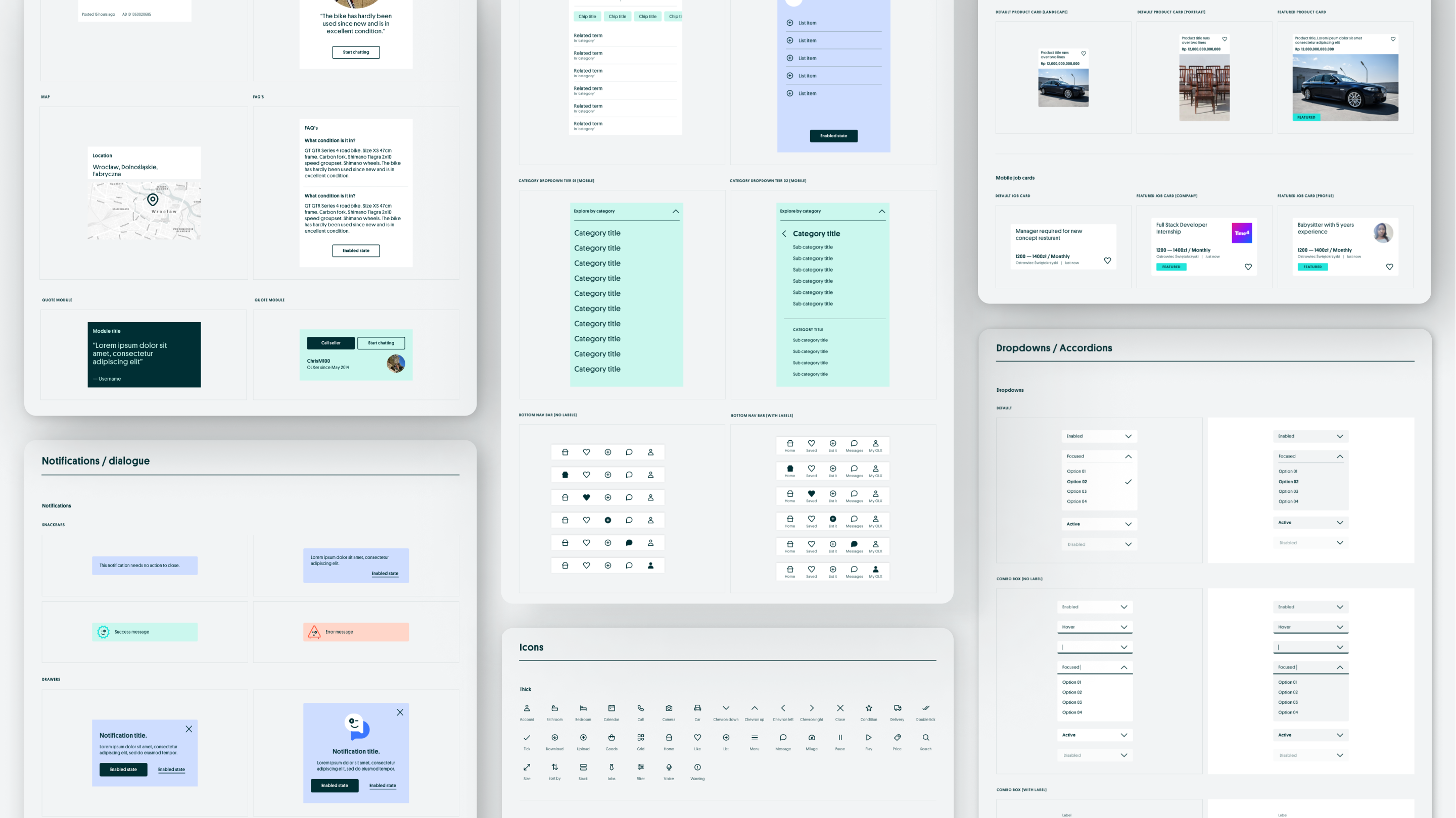
Design system library /
Custom icon suite /
A comprehensive set of custom icons were drawn for both functional and illustrative product moments. Stroke width, line caps and angles were considered in order to deliver a suite that felt in tune with the OLX core visual identity.
✦ Omar Hraib / Design Director.
Got a project you'd like to discuss? Let's talk.
hello [@] omarhraib.com / +44 (0) 7932250050
© Omar Hraib Ltd 2022